A popular article of faith in politics is that in a political campaign, anything is possible. The 2008 US presidential election results are considered amazing, unprecedented and groundbreaking.
Then maps like this come along.
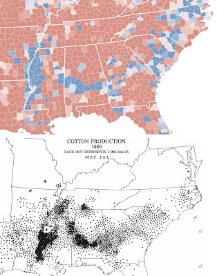
 The coloured map shows election results from the South on county level. Blue counties voted for Obama, red ones for McCain (darker hues representing larger majorities). In spite of Obama’s national victory, and barring Virginia, North Carolina and Florida, all Southern states (i.e. all states formerly belonging to the Confederacy) went for McCain.
Fall back to another time and you have this: the black and white map map dates from 1860 (i.e. the eve of the Civil War), and indicates where cotton was produced at that time, each dot representing 2,000 bales of the stuff. The more dots, the more intensive the cotton cultivation at that time.
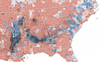
See the pattern? Even better, here are the two maps overlaid so you can see it better.
Then maps like this come along.
 The coloured map shows election results from the South on county level. Blue counties voted for Obama, red ones for McCain (darker hues representing larger majorities). In spite of Obama’s national victory, and barring Virginia, North Carolina and Florida, all Southern states (i.e. all states formerly belonging to the Confederacy) went for McCain.
Fall back to another time and you have this: the black and white map map dates from 1860 (i.e. the eve of the Civil War), and indicates where cotton was produced at that time, each dot representing 2,000 bales of the stuff. The more dots, the more intensive the cotton cultivation at that time.
See the pattern? Even better, here are the two maps overlaid so you can see it better.
 Clearly some voting patterns are stubbornly deep rooted even after 150 years.
-------------------
Thanks to Pin the Tail and Strange Maps for the maps and the deeper analysis available there.


3 comments:
I bet John King of CNN wished he had that map on the magic board election night. Very interesting indeed, seems to link the past with the outcome of the present pretty well.
Simon, keep in mind that many of the southern plantations were not cotton plantations too. South Carolina, for example, was largely rice plantations. So if you look at that wave of blue in SC that doesn't appear to correlate as well to the dots for cotton plantations, well imagine about twice as many dots there if you were to add the rice plantations on the map too. The same applies to that little bit on blue in coastal Georgia, not a cotton plantation area - but plenty of plantations there all the same.
Strange Maps also has a super-awesome overlay map regarding recent election results in Poland.
Post a Comment