(Updated)
Today Premier Danny Wiliams' government allowed to escape released the new brand for the province, its government and its people.
The reasoning, it seems, is we needed to solve the problem of having 40+ brands in government and that we just don't have enough confidence in ourselves.
For a government which has had more success with selling sizzle than steak, this grand gesture is well in character and it's worthwhile looking here to see how the Premier justifies this exercise in his own words.
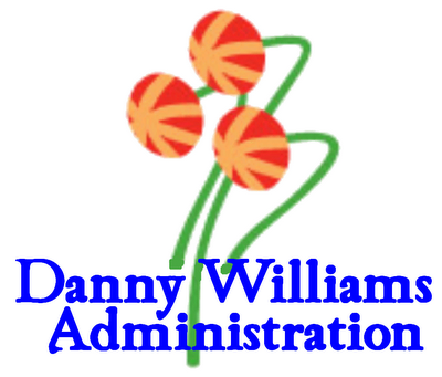
The response on the blogs and talk radio have been amusing and I look forward to the next few days to see what others think. A lot of remarks so far center on the three pitcher plants poking out of the top. What are they? people are asking. Best suggestions so far include aliens, antenna and bakeapples.
Other criticisms point out that the new wordmark is done in an attractive shade PC blue and that the "and" has mysteriously disappeared*. Others have commented that the font is a kind of childish looking celtic style in a province where it's a mistake to assume everybody is celtic. One bright spark who will remain nameless came up with this alternative that they thought was the real intended logo.
I really like George Murphy's take on the issue here. I had no idea he was a poet!
Ed has a sort of little shop of horrors perspective.
WJM at Labradore has an hysterical take on the matter.
I would be remiss if I didn't include TownieBastard's comparision of the logo with parasites and space slugs.
Sue, of course, had must to say about it here and here.
This post at Blue Kaffee makes the point that the defining feature of the pitcher plant is the pitcher which is conspicuously missing from the logo. Imagine if somebody used a rose bush as a logo that omitted the roses?
Like the charming people over at Sure b'y, I don't think the new logo is particularly good or bad - it's just, well, bland.
But it does seem to me that anybody who says that the pitcher plant "grows in a natural environment where no plant should ever grow" clearly has never wandered through this province's wetlands. When you do then you understand that wetlands (bogs) are diverse and rich ecological habitats with everything from water fowl to aquatic and marine life to lush vegetation.
And I'm not sure how any government logo is supposed to inspire confidence in myself. I was already pretty confident in myself before this logo, or this government, came along. In fact, I can safely say that my sense of self-esteem and confidence really has nothing at all to do with policies undertaken by any government or who leads that government.
Confidence certainly does not come from a wordmark and if it does then the problems of the province are far too deep to be solved *that* way.
As a way of attracting business and investment into the province, it leaves much to be desired. Consider this: if somebody gives you a black eye, you'll be keen to avoid them the next time you see them even if they are better dressed. So having seen the treatment which the provincial government has accorded international companies like Abitibi, FPI and Inco among others, why would a brand-spanking new logo make a difference to where you invest?
Perhaps more care in managing substance would be in order.
Today in his media rounds, including the obligatory call to Bill ("Premier, tell us again why you are so awesome") Rowe, Williams said that the introduction of this new brand will be gradual as new vehicles are bought and new stationery is ordered. So I guess for the next 1/2 decade or so, the useful life of a government vehicle, we will be a province of 41+ brands instead of 40+ brands.
Congratulations to this government on simplifying this issue for us.
In the meantime I have my own thoughts on those three little things which float and loom above us. My only question is: peppermint or strawberry??
Enjoy!
==========================
* At 1 million dollars to take out the "and", that means $333,000 for each letter. That's a serious cartage fee!
Proof of Life: 56
-
There's less of me, but more of the
geekery. It balances out.
So 55 is over and done with.
It was the year I started getting senior discounts more often. ...
2 months ago


No comments:
Post a Comment